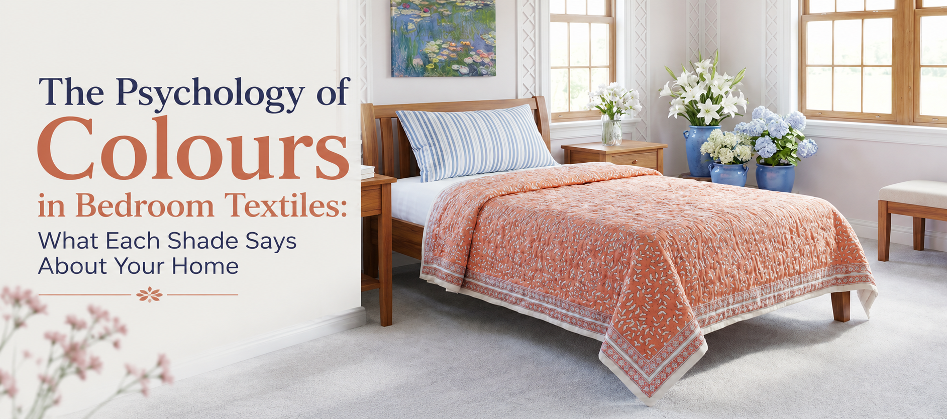
The Psychology of Colours in Bedroom Textiles: What Each Shade Says About Your Home
Long before a bedroom is finished with furniture or lighting, its colour story is already set by the textiles on the bed. A quilt, bedspread or dohar covers more surface area than almost anything else in the room, which means its shade does far more work than most homeowners realise. This is where colour psychology in interior design becomes practical rather than theoretical: the tones chosen for bedding influence how calm, energised, cosy or spacious a bedroom feels, night after night.
The Psychology Behind Bedroom Colour Choices
This field of study looks at how specific hues affect mood, perceived temperature and behaviour within a space. In bedrooms, it explains why cool blues tend to read as restful, why warm terracottas feel grounding, and why the same room can seem larger or smaller depending on tonal choices in the bedding and soft furnishings.
Why the Bedroom Responds to Colour Differently
A living room is viewed in short bursts throughout the day. A bedroom, by contrast, is where the eye rests last before sleep and first upon waking, so its colours are absorbed at a slower, more sustained pace. Textile colour matters more here than paint colour in many UK homes, simply because bedding can be changed seasonally without the cost or disruption of redecorating walls.
Blue and the Case for a Calmer Night
Blue is consistently associated with lowered heart rate and a sense of order, which is part of why it appears so often in sleep-focused research and hotel bedding ranges. In hand block printed textiles, indigo and cornflower tones carry this calming association while still bringing pattern and depth, avoiding the flatness of a plain block colour. A block-printed indigo quilt on a neutral bed frame tends to anchor a room without overwhelming it.
Warm Terracotta, Ochre and Rust
Warm earth tones read as grounding and secure rather than stimulating, which is why they work well even in rooms used for rest. These shades are closely tied to Rajasthani textile traditions, where natural dyes historically produced rich rust, ochre and madder-root reds. In a UK bedroom during the colder months, a rust or ochre bedspread can visually raise the perceived temperature of the room without changing the thermostat.
Green and Its Link to Restorative Sleep
Green sits at the midpoint of the visible spectrum, which is one reason it requires the least adjustment for the human eye and is often described as restful. Sage, olive and forest green in cotton bedding echo the outdoors, an association that has been linked in wellbeing research to lower reported stress. Green also pairs unusually well with the natural, undyed cotton tones common in artisan-made textiles.
Deep Reds and Berries: Depth Without Overstimulation
Pure red is typically avoided in bedrooms because it is associated with alertness rather than rest. Muted, deeper variants such as maroon, berry or brick, however, behave differently: they add richness and warmth while sitting further from the high-alert end of the red spectrum. Used on a single bedspread or as an accent within a printed pattern, these tones bring depth to a room without competing with sleep.
White and Ivory: Space, Light and a Blank Canvas
White and ivory textiles reflect the most light of any colour family, which makes a bedroom feel larger and airier, particularly useful in the smaller box rooms common in UK terraced housing. On their own, these shades can feel clinical, but a white base carrying a hand block printed motif retains the sense of space while introducing pattern and warmth through the print itself rather than through colour saturation.
Grey, Taupe and the Rise of Quiet Neutrals
Grey and taupe have become common defaults in UK bedrooms over the past decade, largely because they sit between the warmth of terracotta and the coolness of blue without pulling strongly toward either mood. Psychologically, this middle ground reads as understated rather than emotionally neutral; a soft grey or taupe quilt rarely dominates a room, which is precisely why designers use it as a base for bolder accent pieces. The risk with an all-neutral bedroom is that it can feel unfinished or flat, particularly under the low, grey daylight typical of a British winter. A handcrafted textile in a muted neutral, printed with visible texture rather than left plain, tends to avoid this problem, since the pattern itself adds interest even when the base colour stays quiet. This is one reason artisan-printed neutrals have grown in popularity alongside the wider trend toward quiet, understated interiors: they offer restraint without sacrificing character.
Indigo, Block Print and a Sense of Heritage
Beyond mood, colour also communicates story, and few textile traditions carry this as visibly as Indian hand block printing. Layering a room with block print quilts introduces indigo, madder and natural dye tones that have been used in Rajasthan for generations, giving a bedroom a sense of history that a single-colour synthetic throw cannot replicate.
How Pattern Density Changes the Way Colour Reads
Two quilts in an identical shade of blue can feel entirely different depending on how densely they are patterned. A tightly repeated small-scale motif reads as texture from across the room and softens the intensity of the base colour, while a large, widely spaced print keeps the colour more dominant and graphic. This is a useful, often overlooked lever: homeowners wanting a bold colour without an overwhelming result can choose a denser print in that same shade.
Choosing Colours for the UK Seasonal Cycle
UK bedrooms benefit from a seasonal approach to textile colour, since natural light levels shift far more dramatically across the year than in many other climates. A lightweight cotton dohar online in a pale or sage tone suits the longer, brighter days of British summer, while a deeper rust or indigo quilt reintroduces warmth once autumn light fades. Swapping textiles seasonally is a lower-cost way to reset a bedroom's mood than repainting.
A Step-by-Step Approach to Building a Bedroom Palette
- Start with the wall colour as the constant. Treat it as the backdrop that every textile colour will be judged against.
- Choose one dominant textile colour for the bed. This is usually the quilt, bedspread or dohar, since it covers the largest surface area.
- Add one supporting neutral. Undyed cotton, ivory or soft grey allows the dominant colour to stand out without competing.
- Introduce one accent through cushions or a throw. A smaller quantity of a bolder shade, such as berry or ochre, adds depth without dominating.
- Test the palette in both daylight and lamp light. Block-printed natural dyes in particular can shift subtly under warm artificial light.
Layering Colour Through Quilts and Bedspreads
Layering is where these colour principles become most visible in practice, since it is rarely one textile doing the work but several in combination. Pairing a base cotton quilts online selection with a contrasting bedspread and a scatter of smaller cushions allows a room to carry two or three colours in balance rather than one flat block of tone. Reversible pieces make this easier still, since a single quilt can offer two different colour moods depending on which side is turned up for the season.
Percale, Weave and Why Texture Affects Colour Perception
The weave of a fabric changes how light bounces off its surface, which in turn affects how saturated or muted a colour appears. A tighter percale weave, as used in cotton percale bedding, produces a smoother, slightly crisper surface that can make a colour look cleaner and more defined, while a quilted or textured weave softens the same shade into something more muted and tactile.
Choosing an Authentic Base Piece
Because bedding colour is judged against the base piece more than any accessory, it is worth starting there. Many UK shoppers researching jaipuri quilts online are specifically looking for the vibrant, naturally dyed colourways associated with Rajasthani block printing, distinct from the flatter, more uniform tones typical of mass-manufactured bedding. A block print bedspread in one of these traditional colourways can function as the anchor piece a bedroom palette is then built around. Once that anchor is chosen, every other decision in the room, from cushion tone to wall shade, becomes easier to make, since it only has to complement one considered colour rather than compete with several undecided ones.
Frequently Asked Questions
What colours are best for a calm, restful bedroom?
Cool tones such as blue, sage green and soft indigo are generally considered the most restful, since they are associated with a lowered heart rate and reduced visual stimulation. Muted warm tones like terracotta and ochre can also feel calming, provided they are not overly bright or saturated.
Does bedroom colour actually affect sleep quality?
Research on colour and mood suggests that cooler, muted tones support relaxation more consistently than bright, high-saturation colours, which are linked to alertness. Bedding colour alone will not fix sleep problems, but it can contribute to a room that feels easier to switch off in.
Should bedroom textile colours change with the seasons?
Many UK homeowners do rotate bedding colour seasonally, using paler, lighter tones through spring and summer and deeper, warmer shades from autumn onward. This is a practical way to shift a room's mood without the cost of repainting.
How do I choose a colour for a small bedroom?
Lighter, low-contrast colours such as ivory, pale blue or soft sage tend to make a small bedroom feel more open, since they reflect more light. A single patterned piece in a deeper colour can still be introduced as an accent without shrinking the sense of space.
What makes hand block printed colours different from standard dyed bedding?
Hand block printed textiles typically use natural or small-batch dyes applied by hand, which produces subtle variation in tone and saturation from piece to piece. This gives the colour a depth and character that flat, machine-dyed bedding usually lacks.
In Short: Colour is one of the most affordable and reversible decisions in bedroom design, yet it shapes mood more consistently than almost any other choice. Understanding colour psychology in interior design turns bedding from a functional purchase into a deliberate tool for how a room feels to wake up in. The most enduring bedrooms tend to build their palette around one honest, well-made base textile, then layer supporting tones around it with restraint.
-
 September 18th, 2026
 -

The Art of Layering Textiles: How UK Homes Can Mix Quilts & Tablecloths
September 11th, 2026 -

Duvet vs Quilt vs Bedspread: What's the Difference and Which One Do You Need?
September 11th, 2026 -
 August 26th, 2026