
The Power of Color: Understanding Color Theory in Hand Block Printing
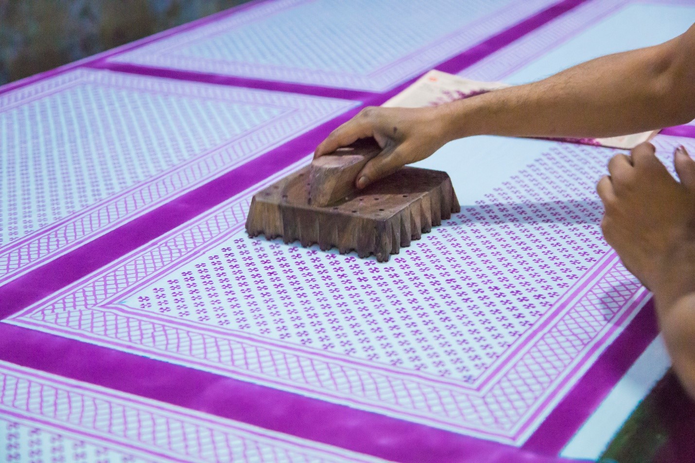
Hand block printing is a traditional printing technique that has been around for centuries. It involves the use of wooden blocks, carved with intricate designs, that are used to stamp patterns onto fabric. The designs are often colorful and vibrant, and this is where the power of color comes in. In this article, we will explore the basics of color theory in hand block printing and how it can impact the final product.
Understanding the Color Wheel
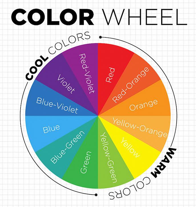
The color wheel is the foundation of color theory. It is a visual representation of the primary, secondary, and tertiary colors and how they relate to each other. In hand block printing, the color wheel is used to create harmonious color combinations that work well together.
Primary colors are the three basic colors - red, yellow, and blue. Secondary colors are created by mixing two primary colors - orange, green, and purple. Tertiary colors are created by mixing a primary and a secondary color - for example, red-orange or yellow-green.
Choosing a Color Scheme
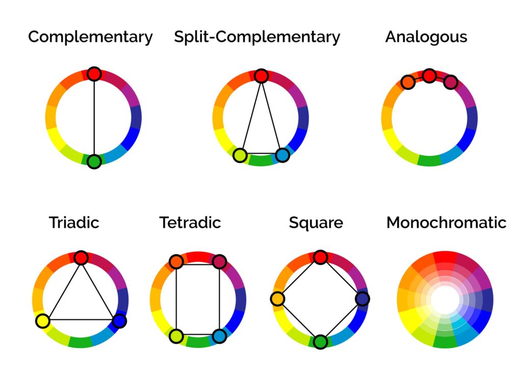
Once you understand the color wheel, you can start to choose a color scheme for your hand block printing project. There are several different color schemes to choose from, including monochromatic, complementary, analogous, and triadic.
Monochromatic color schemes involve using different shades and tints of the same color. This can create a soothing and calming effect, and is often used in home decor and fashion.
Complementary color schemes involve using colors that are opposite each other on the color wheel. For example, blue and orange, or red and green. This can create a bold and eye-catching effect.
Analogous color schemes involve using colors that are next to each other on the color wheel. For example, blue, blue-green, and green. This can create a harmonious and cohesive effect.
Triadic color schemes involve using three colors that are equally spaced on the color wheel. For example, red, yellow, and blue. This can create a dynamic and energetic effect.
Using Color in Hand Block Printing
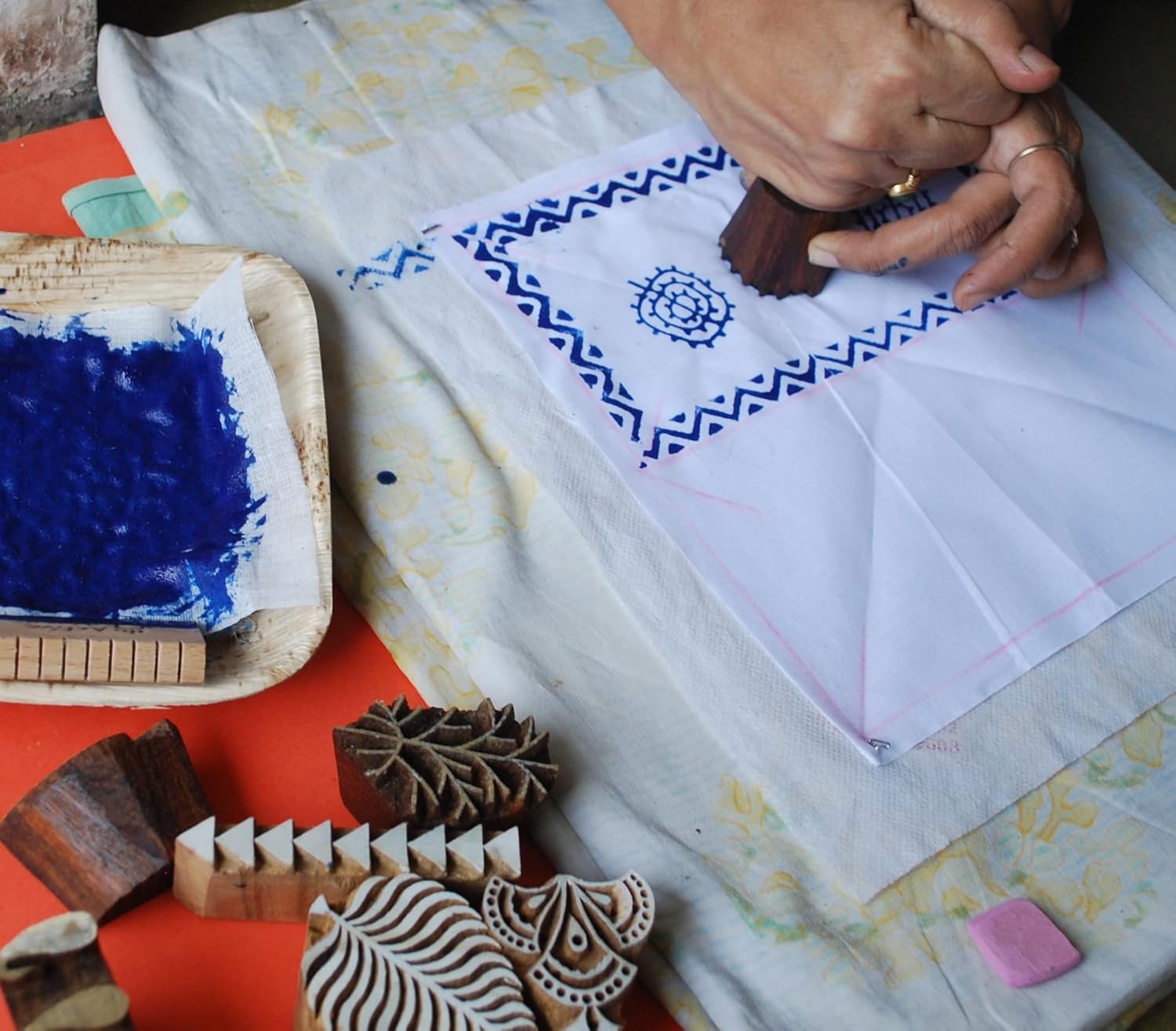
Once you have chosen a color scheme, it's time to start thinking about how to use color in your hand block printing project. There are several different ways to incorporate color into your design, including using different block colors, layering colors, and using color gradients.
Using different block colors involves using different blocks for different colors. For example, you might use one block for the background color and another block for the pattern color. This can create a bold and contrasting effect.
Layering colors involves using multiple blocks to create a design with multiple colors. This can create a complex and intricate effect.
Using color gradients involves using different shades of the same color to create a gradual transition from one color to another. This can create a subtle and sophisticated effect.
The Impact of Color on the Final Product
The colors you choose and how you use them can have a big impact on the final product. Color can evoke emotions and create a mood, so it's important to choose colors that align with the message you want to convey.
For example, warm colors like red, orange, and yellow can create a sense of energy and excitement, while cool colors like blue, green, and purple can create a sense of calm and relaxation. Neutral colors like black, white, and gray can create a sense of sophistication and elegance.
In addition to creating a mood, color can also affect how the final product is perceived. For example, using a complementary color scheme can make the design stand out and appear more vibrant, while using a monochromatic color scheme can make the design appear more subdued and subtle.
Understanding color theory is an important aspect of hand block printing. By understanding the color wheel, choosing a color scheme, and using color in your design, you can create a final product that is both visually appealing and effective in conveying your message. Color can evoke emotions, create a mood, and affect how the final product is perceived, so it's important to choose colors that align with your message and design goals.
When creating a hand block printing project, take the time to consider your color choices and how you want to use color in your design. Experiment with different color schemes, block colors, layering techniques, and color gradients to see what works best for your project.
Remember that color is a powerful tool that can help you create a design that stands out and makes an impact. With a little bit of knowledge about color theory and some creativity, you can create a hand block printing project that is both beautiful and effective.


